01 / Case Study

BioCatch

Turning behavioral biometrics into a category-defining brand.

Role
Director, Brand Marketing
Period
2019 – 2021
Disciplines
Brand Strategy · Competitive Positioning · Product Marketing · Digital · Creative Leadership
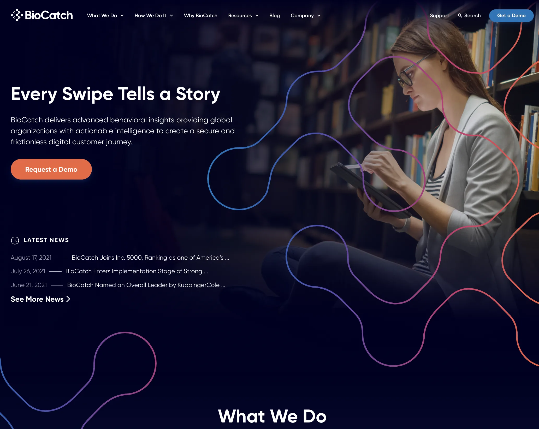
BioCatch.com homepage after the rebrand, with the headline Every Swipe Tells a Story over a dark editorial hero image.
150%
First-year ARR growth after rebrand
$145M
Series C led by Bain Capital
30+
New enterprise logos

Context

BioCatch had pioneered behavioral biometrics, but the category it invented was barely legible to the people buying it. Awareness of what behavioral did — and why it mattered — varied wildly between stakeholders inside the same prospective customer.

The competitive landscape was fragmented rather than consolidated. Customer logos were not openly discussed, and every vendor kept its technical specs under lock and key. That left very little for buyers to compare on, which made brand identity the actual differentiator rather than a cosmetic layer on top of one.

Adjacent security brands had already worked this out. Splunk, CrowdStrike and Idemia were all running confident, highly recognizable design systems. BioCatch was not.

My role

I owned brand definition, competitive differentiation, and product-market positioning, leading a hybrid team of internal operators, vendors, and freelancers.

That covered the research and positioning work up front, the visual identity and design system, the style guide and brand book, channel-specific content, and the rebuild of BioCatch.com as a flagship site on HubSpot CMS — new UX, copywriting, resource library, and multimedia.

Selected work

Reading a fragmented category

Before proposing anything visual, we mapped where the category actually was: who was perceived as established versus trendy, where the knowledge gaps sat inside buying committees, and what BioCatch looked like next to everyone else.
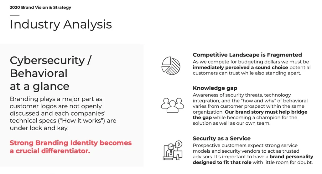
Industry analysis slide arguing that strong brand identity becomes a crucial differentiator in cybersecurity.
The argument that unlocked budget: when specs and customer lists are both private, brand is the only thing a buyer can evaluate early.
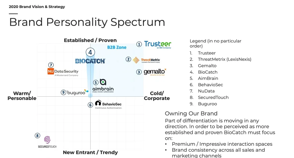
Brand personality spectrum plotting BioCatch and nine competitors across established/trendy and warm/cold axes.
Plotting the field on warm/cold and established/trendy showed the direction of travel — and that BioCatch had to look both proven and more human than the cold end of the market.
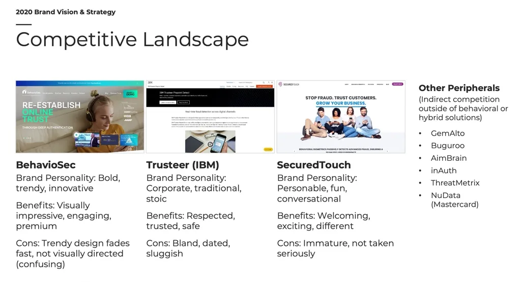
Competitive landscape teardown of BehavioSec, Trusteer and SecuredTouch with brand personality, benefits and drawbacks.
Each competitor was assessed on what its brand earned it and what it cost — trendy design that dates fast, corporate design that reads sluggish, personable design that isn't taken seriously.
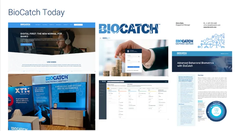
Collage of BioCatch marketing materials before the rebrand, labelled BioCatch Today.
The honest starting point. Individually competent pieces that did not add up to a recognizable system.

Borrowing intelligence from adjacent brands

Rather than benchmark only direct competitors, we studied security and identity brands that had solved recognition well, and named the specific mechanic each one used.
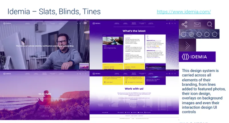
Analysis of Idemia's design system built from slats, blinds and tines.
Idemia — a single geometric motif carried into photos, icons and UI.
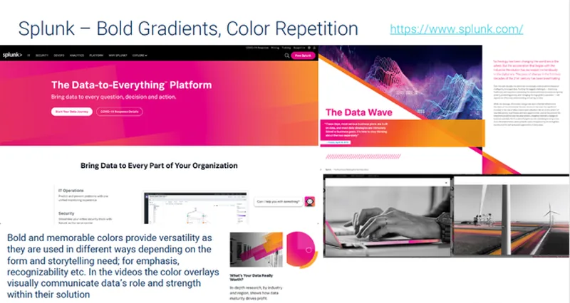
Analysis of Splunk's bold gradients and repeated colour treatment.
Splunk — colour doing the recognition work, applied with real range.
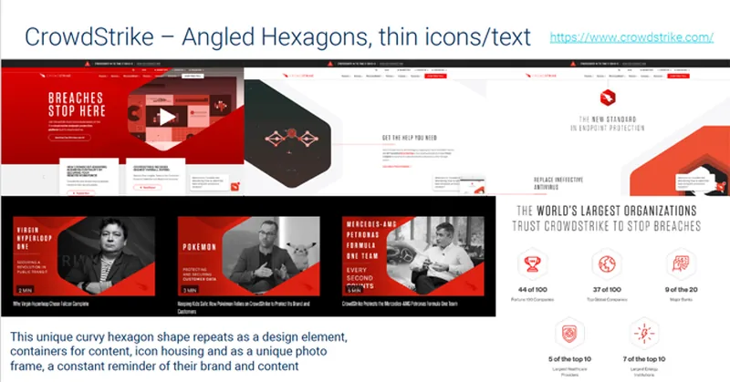
Analysis of CrowdStrike's angled hexagons and thin icon and text treatment.
CrowdStrike — one container shape repeated until it became shorthand for the brand.

Building the identity

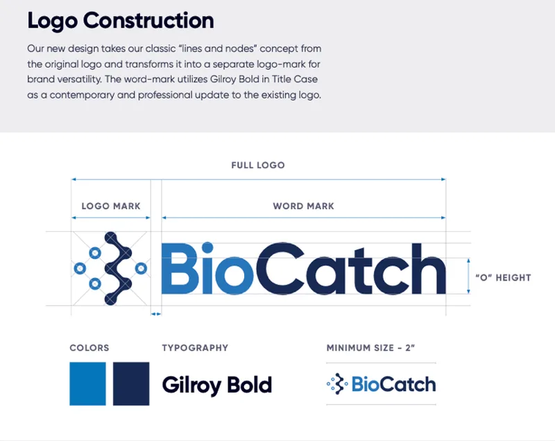
The logo-mark kept the original lines-and-nodes concept and separated it from a new Gilroy Bold word-mark, so the mark could work on its own. The palette was the contentious part.
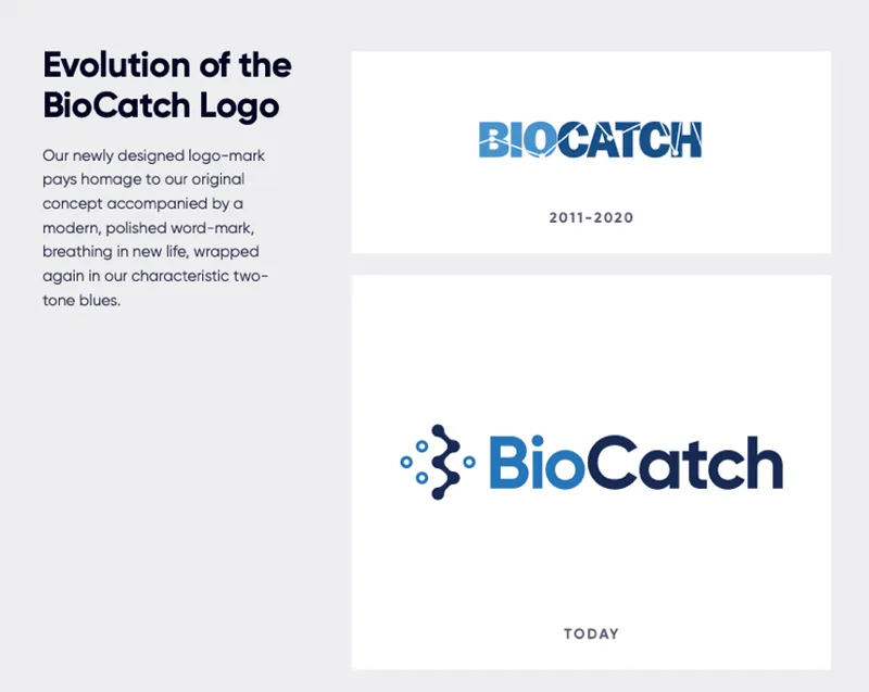
Before and after comparison of the BioCatch logo, 2011–2020 versus the new mark.
The new mark pays homage to the original concept rather than discarding it — important internally, where the old logo had real attachment.
Logo construction diagram showing full logo, logo mark, word mark, colours, typography and minimum size.
Constructed so it survived being used by people who were not designers, which is most of the people who use a logo.
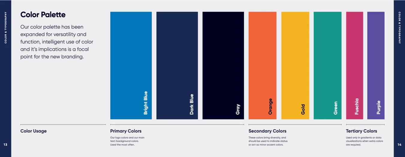
BioCatch colour palette showing two-tone blues alongside orange, gold, green, fuchsia and purple secondaries.
A rainbow-sherbet range against two-toned blue, specifically to break from the cold, sci-fi palettes every cybersecurity brand shared.
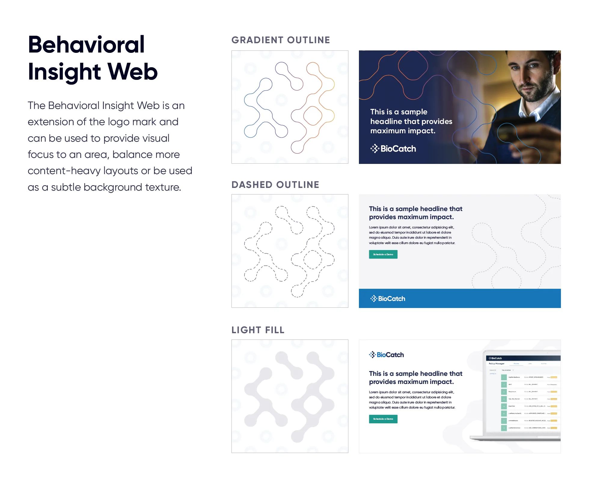
Behavioral Insight Web design system element shown in gradient outline, dashed outline and light fill variants.
The Behavioral Insight Web extended the logo mark into a reusable device — focus, texture, or background — so layouts stayed recognizable without repeating the logo.

Defining what the brand believed

A design system only holds if the language underneath it is settled. We documented position, promise, persona and tone, then mapped every touchpoint the brand would have to live in.
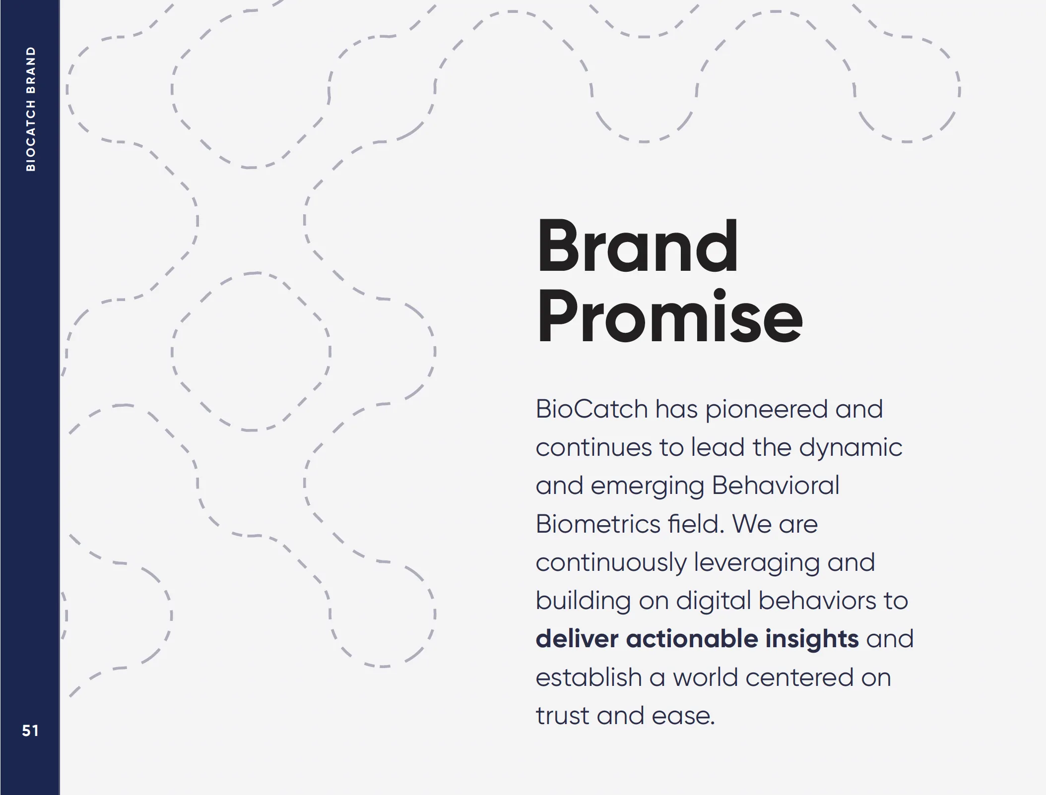
Brand promise slide describing BioCatch's commitment to actionable insights and a world centered on trust and ease.
The promise that the website headline was eventually written from.
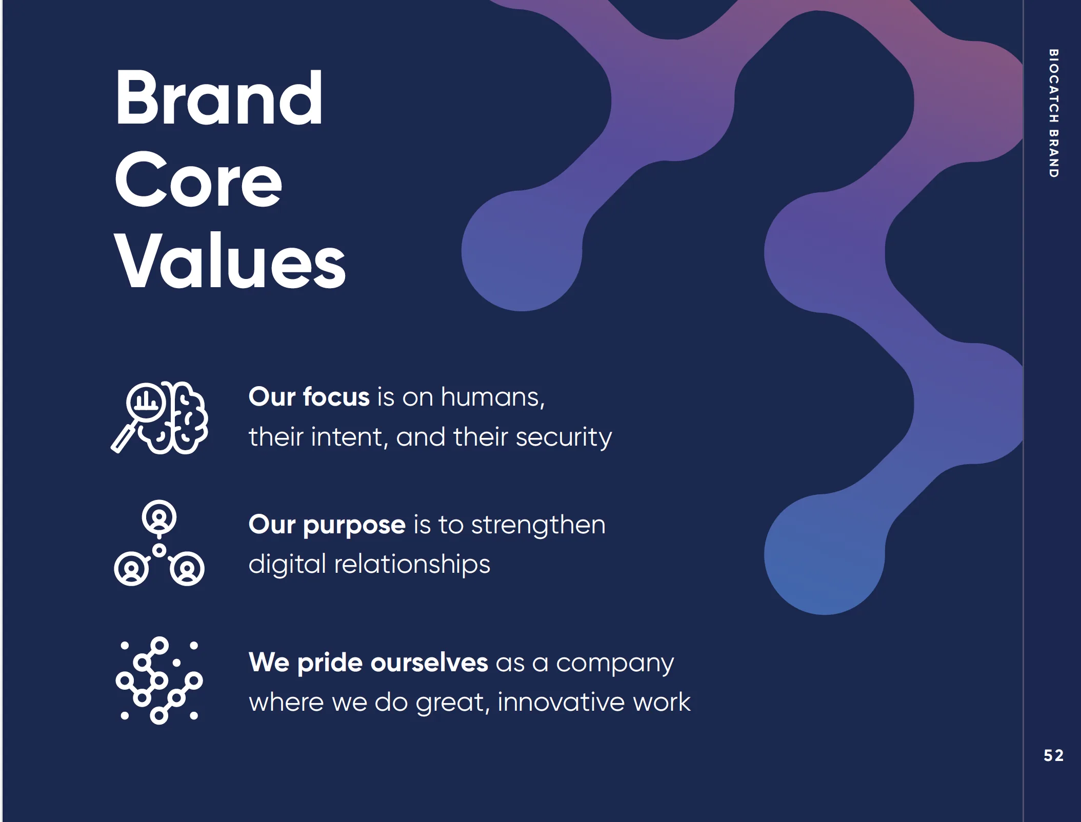
Brand core values slide: focus on humans and their intent, purpose to strengthen digital relationships.
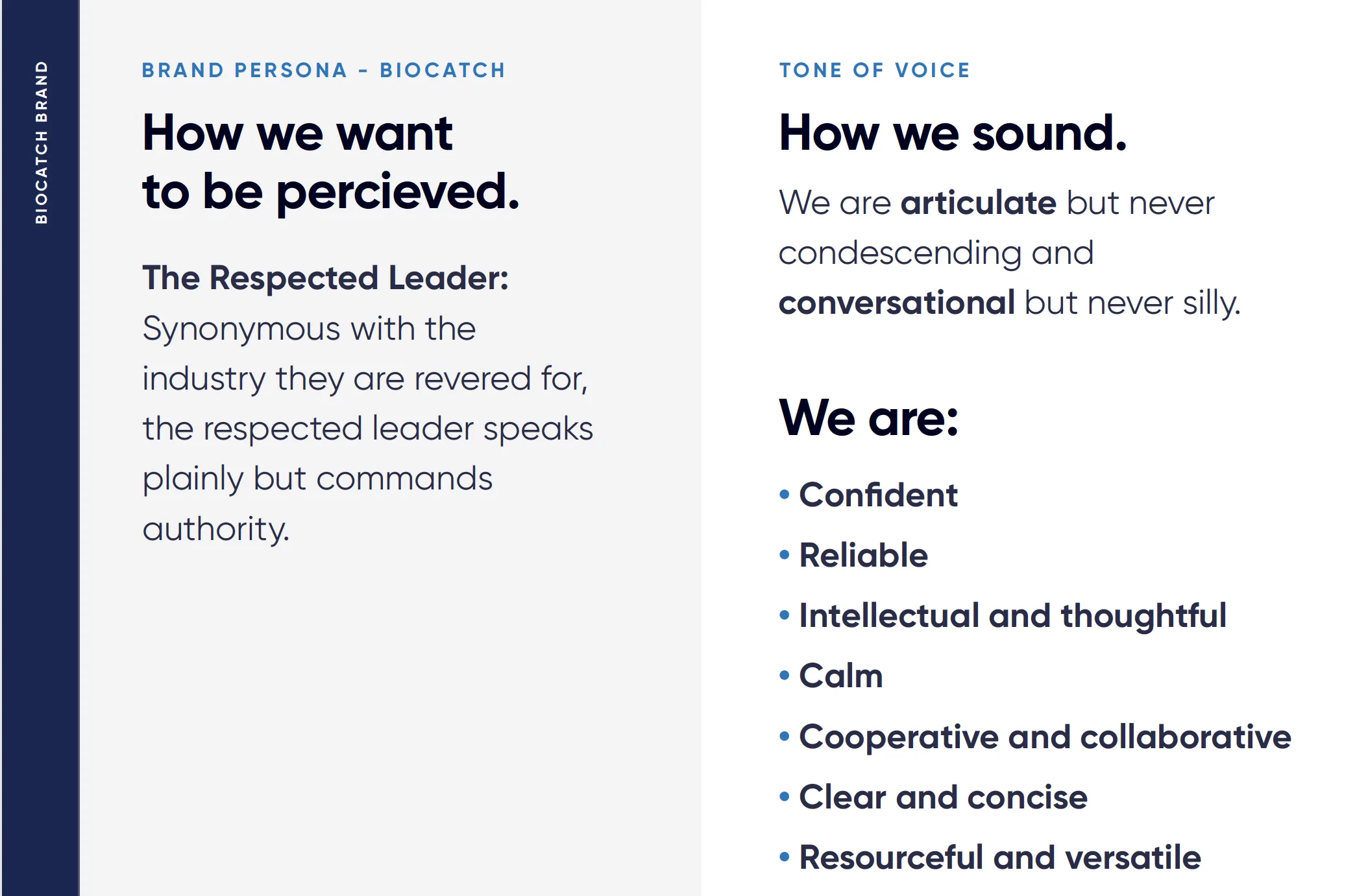
Brand persona and tone of voice slide describing BioCatch as the respected leader — articulate but never condescending.
Tone written as constraints rather than adjectives — articulate but never condescending, conversational but never silly.
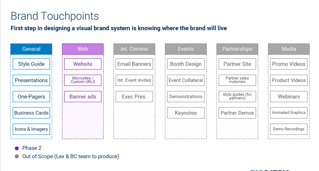
Brand touchpoints matrix covering general, web, internal comms, events, partnerships and media assets.
Knowing where the brand had to live, before designing it, is what kept the system from being a logo with a style guide attached.
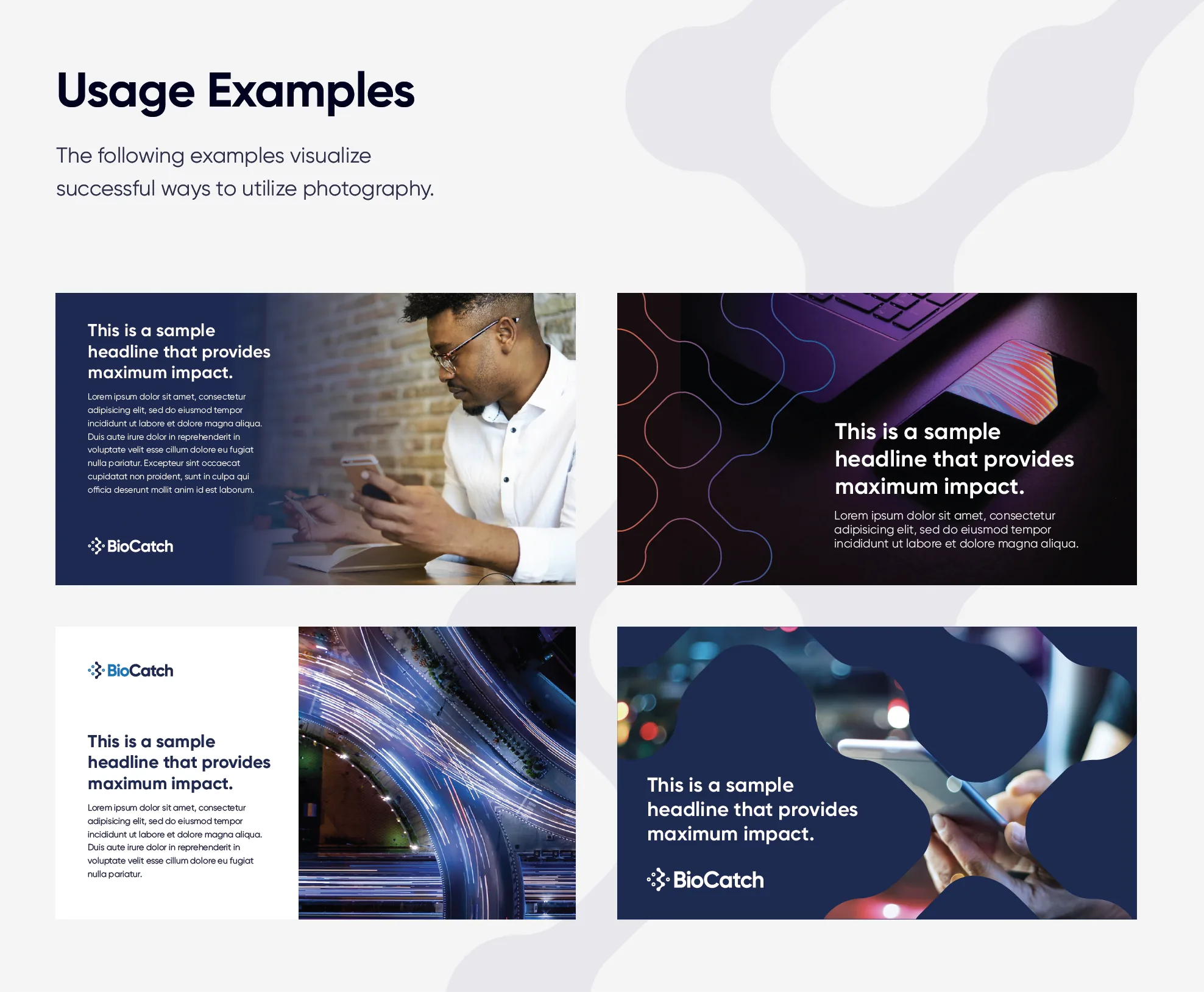
Photography usage examples showing approved image treatments with headline overlays.

Putting it in market

The website was the proof. Technical language was reoriented into common-sense terms, product names and use cases were simplified for industry adoption, and we went after logo rights and testimonials from customers who had never been named publicly.
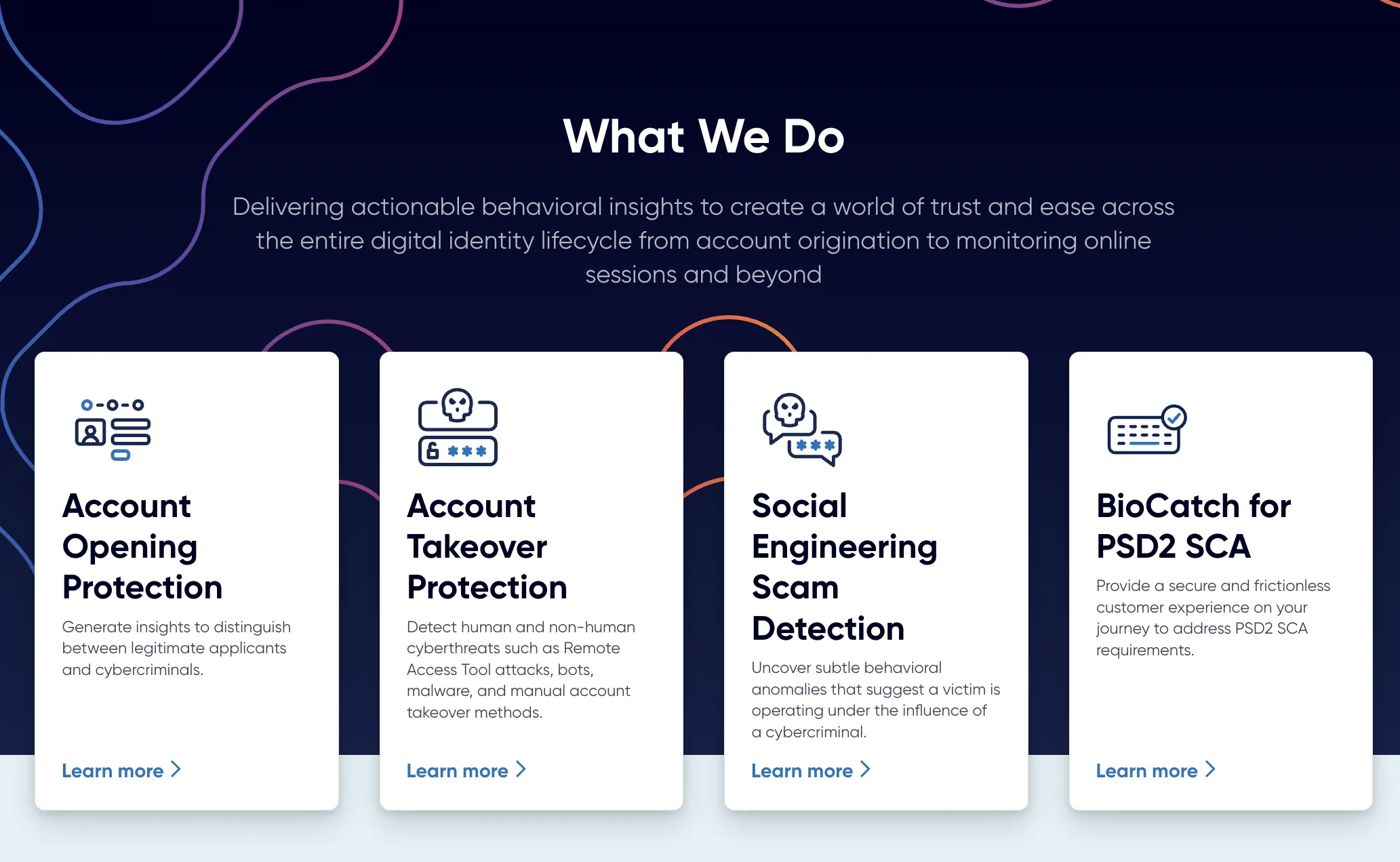
BioCatch website What We Do section with four product cards for account opening, account takeover, social engineering scam detection and PSD2 SCA.
Four plain-language problems instead of a product taxonomy. This was the first time the portfolio was described the way buyers described it.
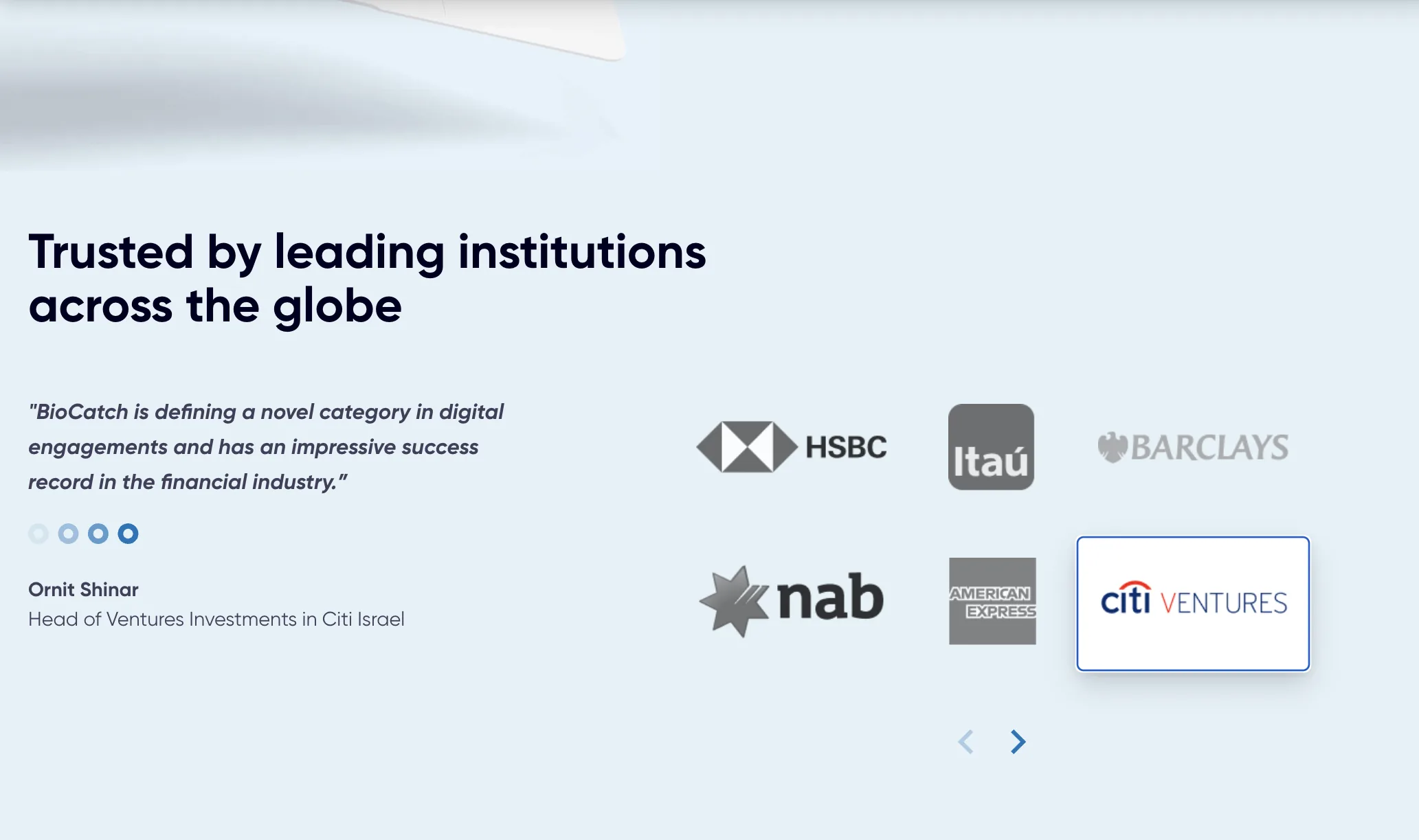
Website section titled Trusted by leading institutions across the globe with HSBC, Itau, Barclays, NAB, American Express and Citi Ventures logos and a customer quote.
Named institutions and a Citi Ventures quote. In a market where nobody published their customers, this told visitors they were either in good company or being left out.
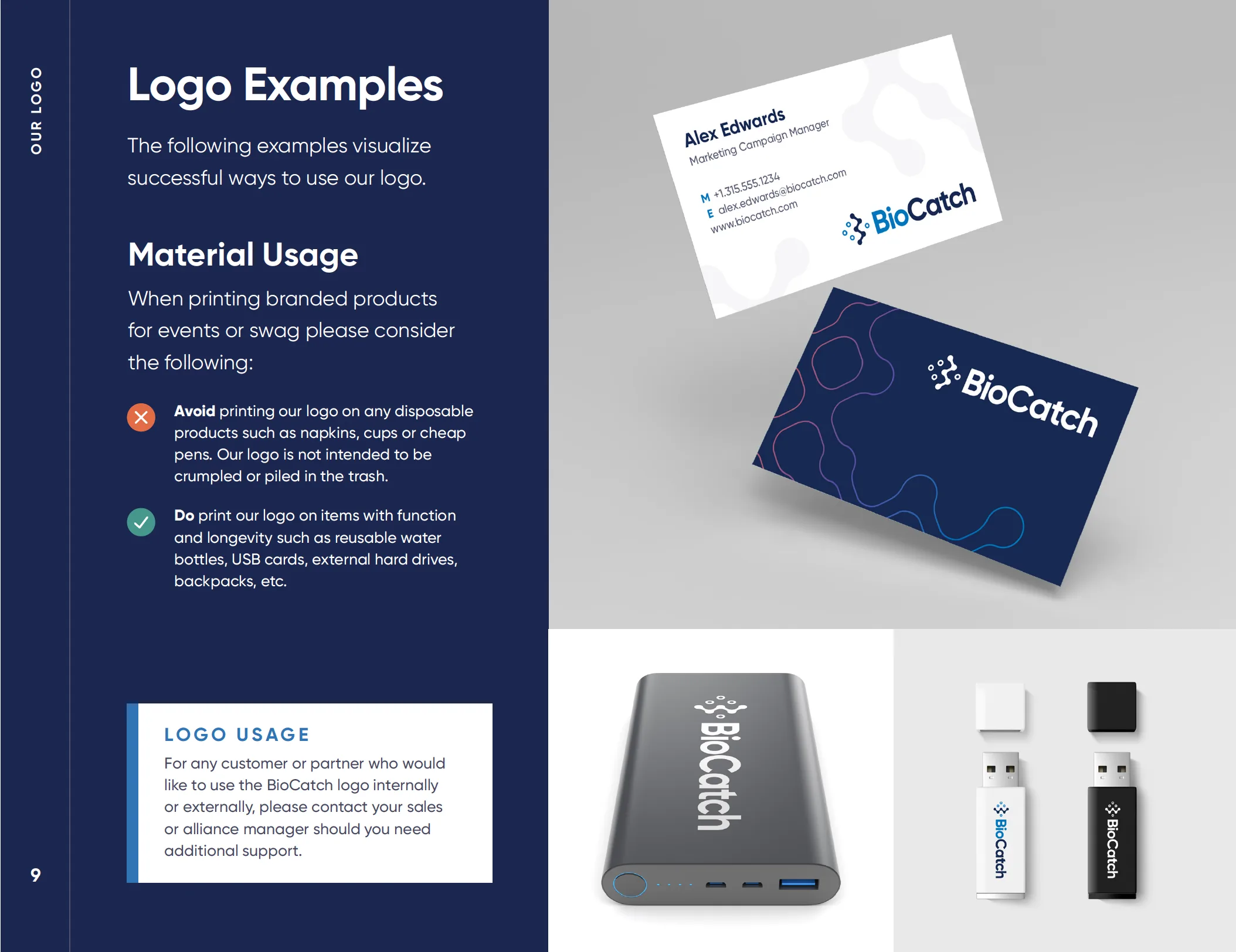
Logo usage and material guidance page showing correct and incorrect applications on printed products.
Guidance written for the vendor and swag decisions that actually get made.
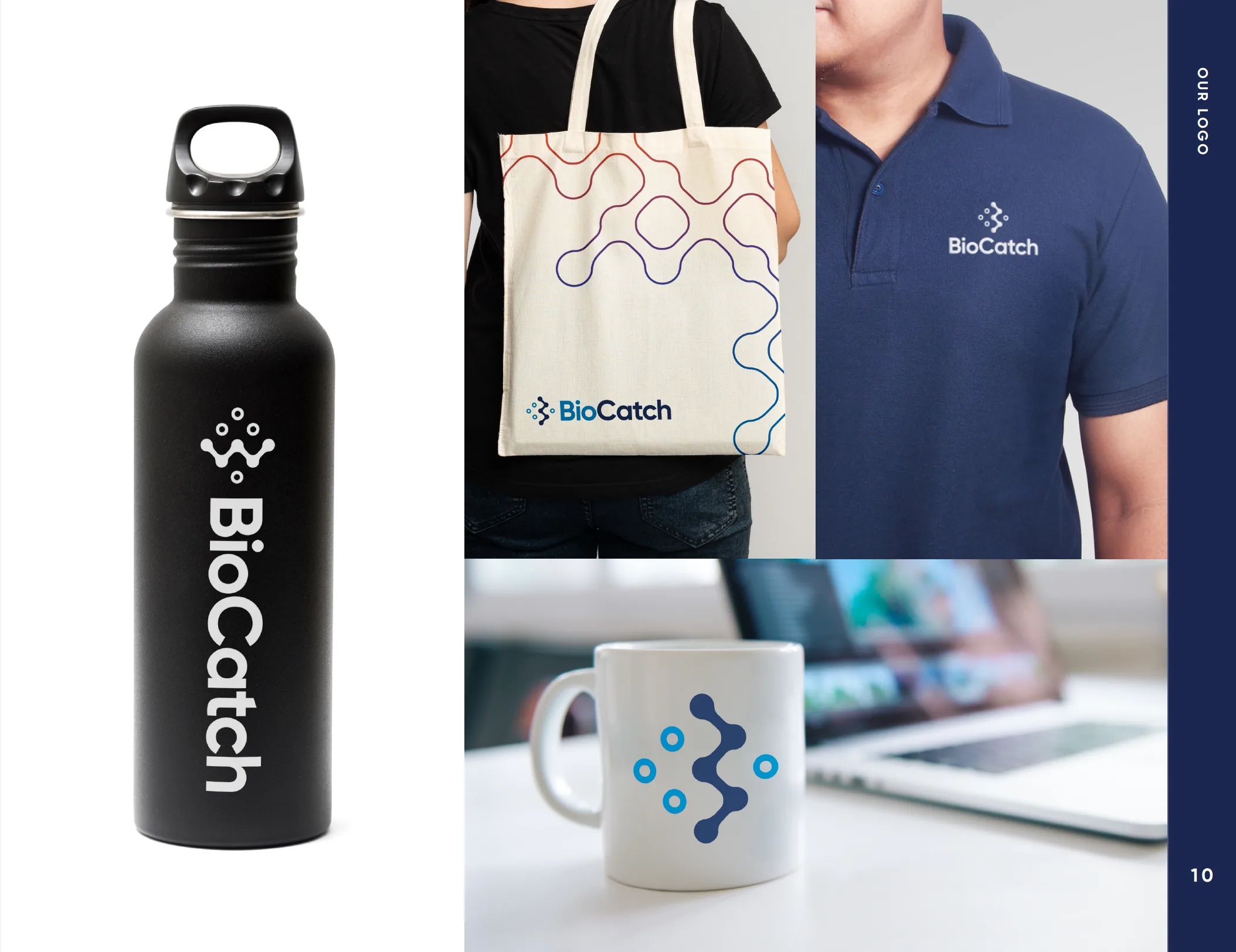
Branded BioCatch merchandise including water bottle, tote bag, polo shirt and mug showing the design system applied.
The palette earning its keep — the system reads as BioCatch on objects with no logo lockup visible at all.

Before and after

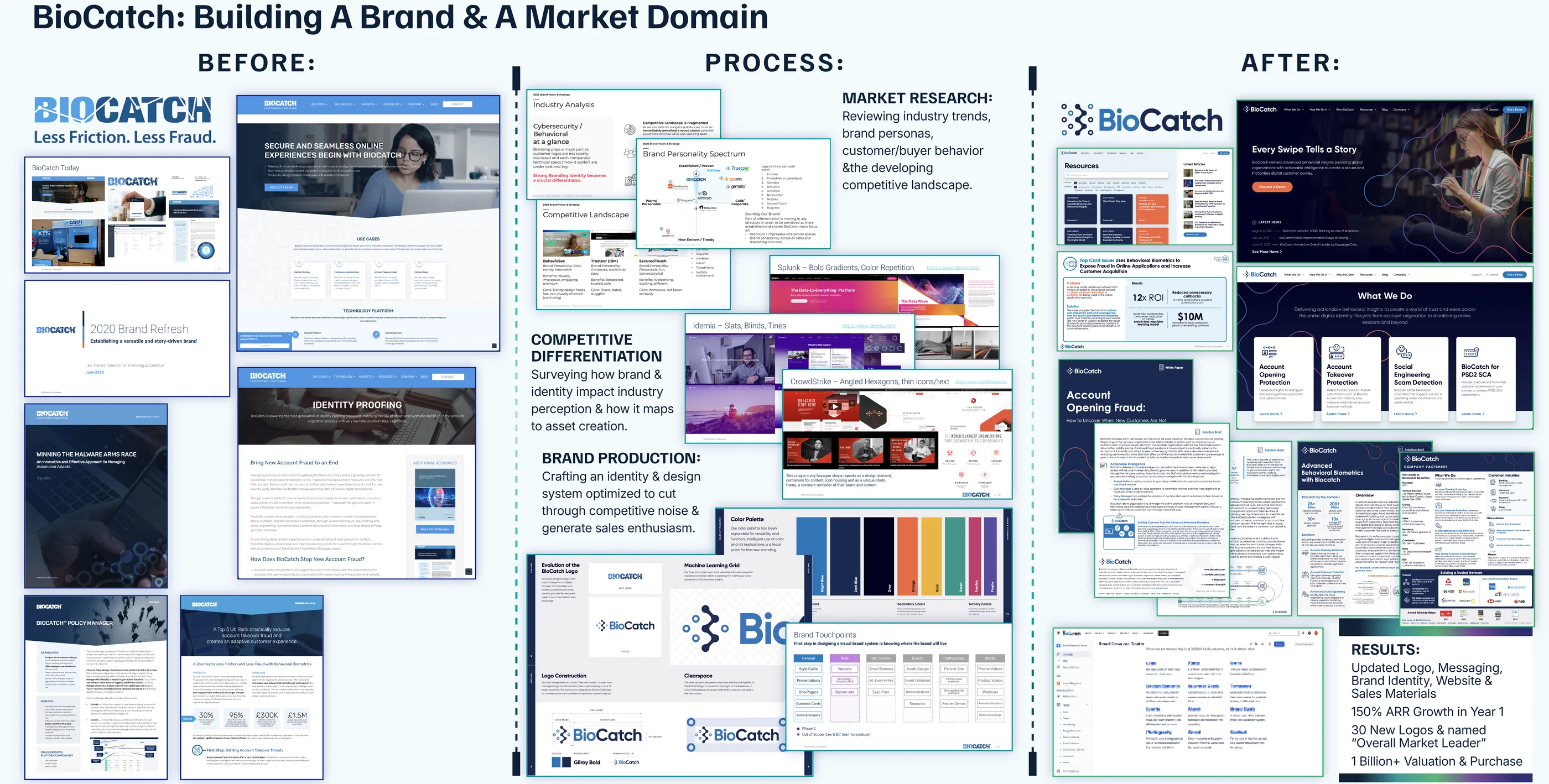
Before, process and after retrospective board for the BioCatch brand refresh and market creation programme.

What changed

  • The rebrand preceded 150% first-year ARR growth and more than 400% valuation growth.
  • The rebrand period coincided with a $145M Series C investment led by Bain Capital and more than 30 new enterprise logos.
  • BioCatch.com relaunched as a flagship website on HubSpot CMS with updated UX, copywriting, resource library and multimedia content.
  • KuppingerCole named BioCatch Overall Leader in fraud reduction during my tenure.
  • BioCatch was acquired in 2024 at a $1.3B valuation.

Looking back

The palette was the argument that took longest to win. Rainbow-sherbet next to two-tone blue looked reckless inside a cybersecurity company, and the instinct in the room was to stay cold and technical. It worked because it made BioCatch legible where every competitor looked identical.

What I underestimated was adoption. Most of the first year after launch went into helping sales, product and partner teams use the system confidently rather than into designing it. The identity was the visible deliverable. Getting other people to reach for it was the real one.