03 / Case Study

Sift

Pulling a fraud platform out of visual sameness.

Role
Director, Brand Marketing
Period
2023 – 2024
Disciplines
Brand Strategy · Competitive Research · Sub-brand Creation · Event Marketing · Web
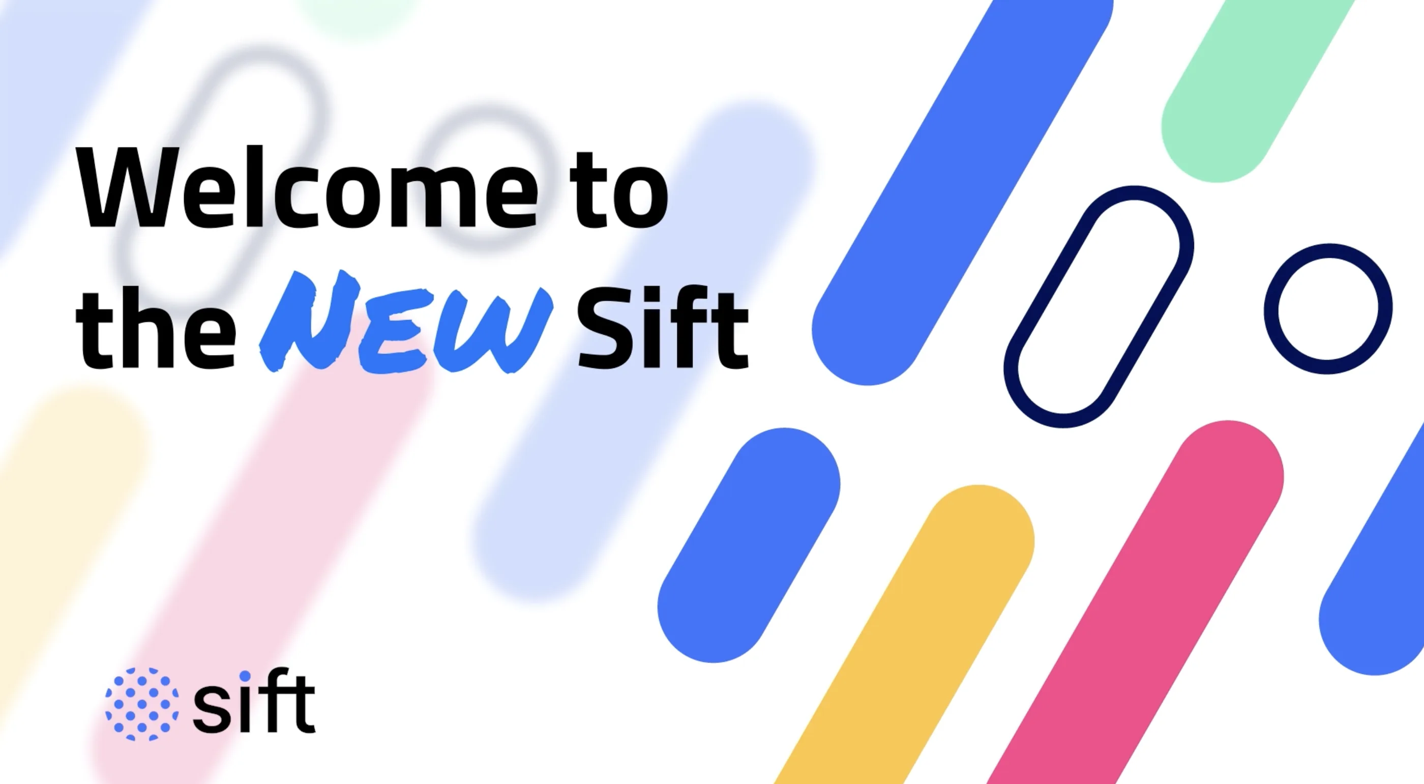
Welcome to the New Sift launch graphic using the refreshed movement-based design system in blue, pink, green and yellow.
90%
Increase in engaged website sessions
12 pts
Gain in overall brand impact score
5x
ROI on branded events

Context

Sift's visual identity was in real danger of sameness inside an already crowded data and fraud security market. Laid out side by side, Sift, Forter, Kount, SEON and Riskified were close to indistinguishable — same blues, same stock photography, same product screenshots.

That is a commercial problem, not an aesthetic one. If a buyer cannot tell five vendors apart on sight, the brand contributes nothing to the deal and every conversation restarts from zero.

I led brand, creative, and web development teams, and built the metrics framework and roadmap to reposition Sift and its platform for market leadership in digital fraud prevention.

My role

I ran the competitive whitespace analysis, defined the new direction, and led the teams that built it: a new design language, website experience, and sales enablement system, plus the event programme it launched through.

Alongside the refresh I named and launched FIBR as a separate sub-brand, and built the regional event strategy that carried the new identity into market.

Selected work

The sameness problem

The fastest way to win the argument was to stop describing it. We laid the immediate competitive set out as style tiles and let the room see how interchangeable they were.
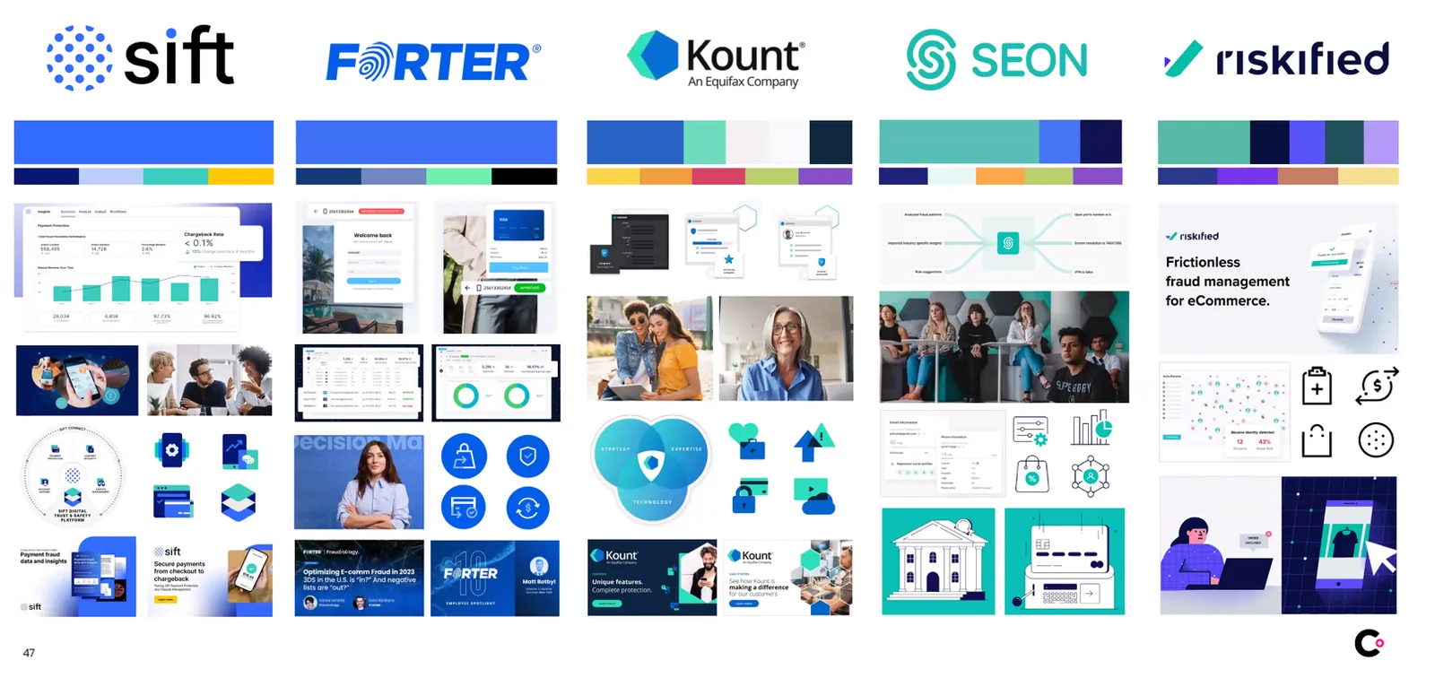
Side-by-side style tile comparison of Sift, Forter, Kount, SEON and Riskified showing near-identical colour and imagery choices.
One slide, no commentary needed. This is the artefact that made a bolder direction an easy decision rather than a risky one.
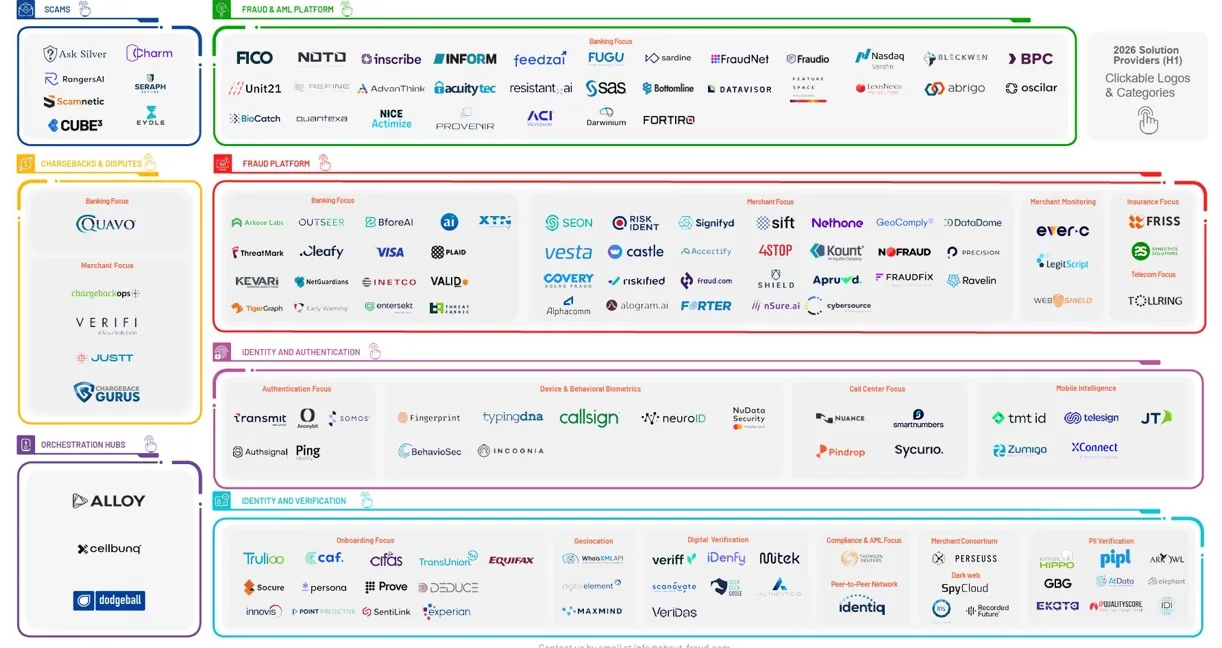
Data security market and fraud solution provider landscape diagram.
Fraud-specific providers mapped by category, to find where Sift could credibly claim ground rather than where it merely competed.

Finding ownable whitespace

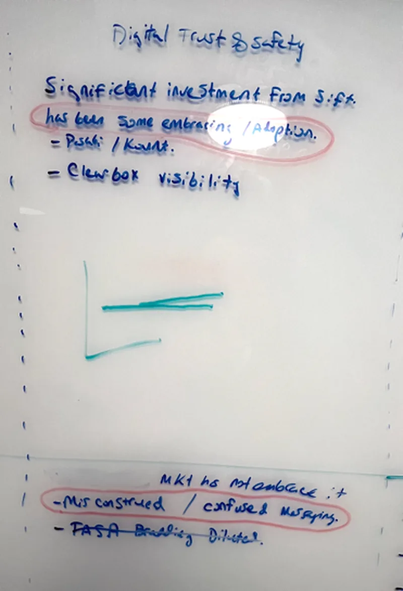
We ran executive sessions to document areas of whitespace Sift could actually own, then pressure-tested each one against the product roadmap before any of it reached design.
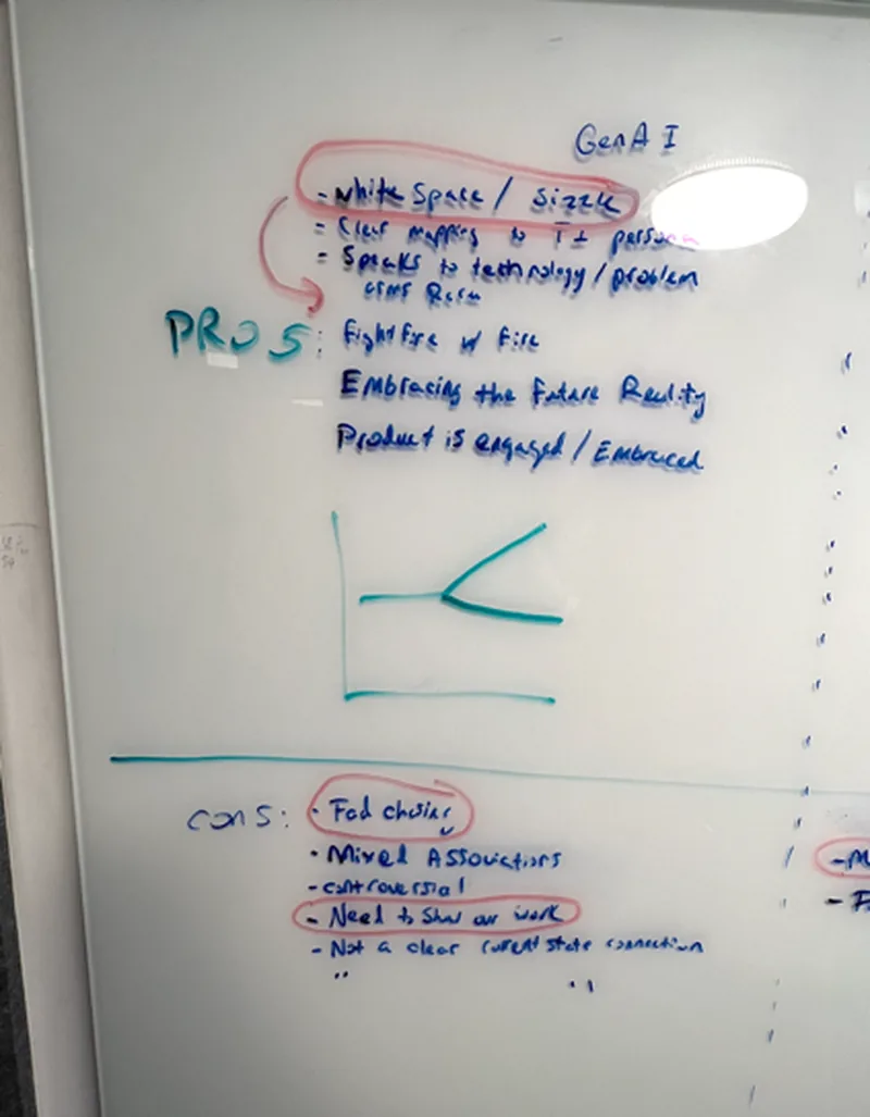
Whiteboard from an executive whitespace session noting white space, size fit and messaging pros and cons.
Working sessions, documented as-is. Getting executives to write the constraints themselves is what stopped the direction being relitigated later.
Second whiteboard on digital trust and safety noting Sift's investment and Clearbox visibility.

A bolder identity

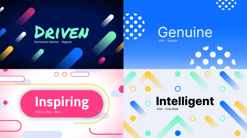
The refresh introduced a new colour palette, a movement-based design system, and gritty handwritten type for personality — deliberately further from the category than anything on the comparison tile.
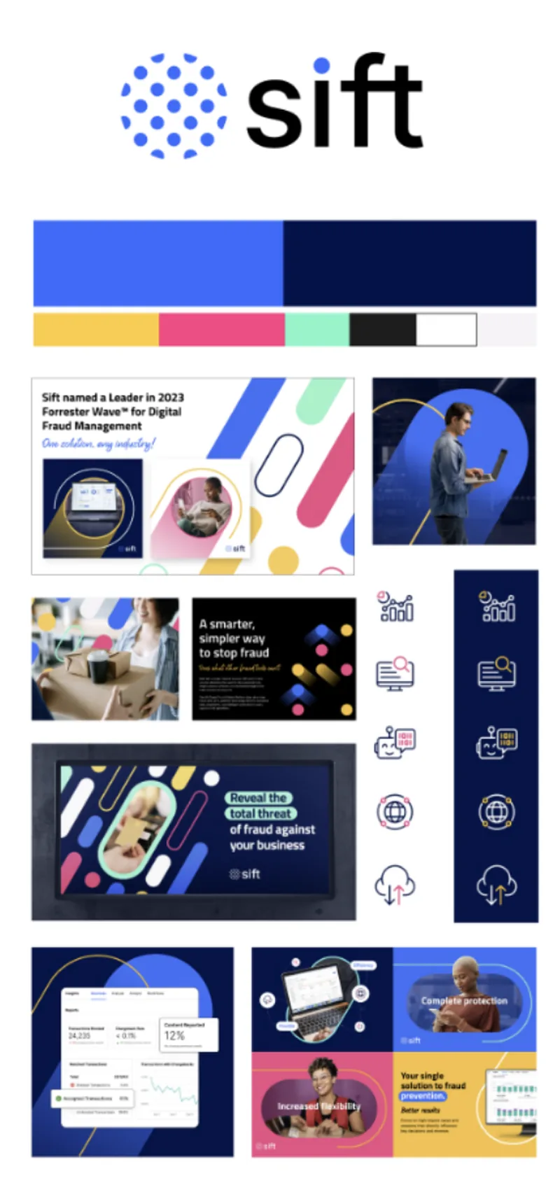
Refreshed Sift style tile showing new palette, motion-based shapes and applied examples.
The same format as the competitor comparison, so the difference was measured on identical terms.
Four brand personality visual identities reading Driven, Genuine, Inspiring and Intelligent, each in a different palette and typeface treatment.
Four personality traits given their own visual treatment. Handwritten type carried the warmth; the geometry kept it credible.
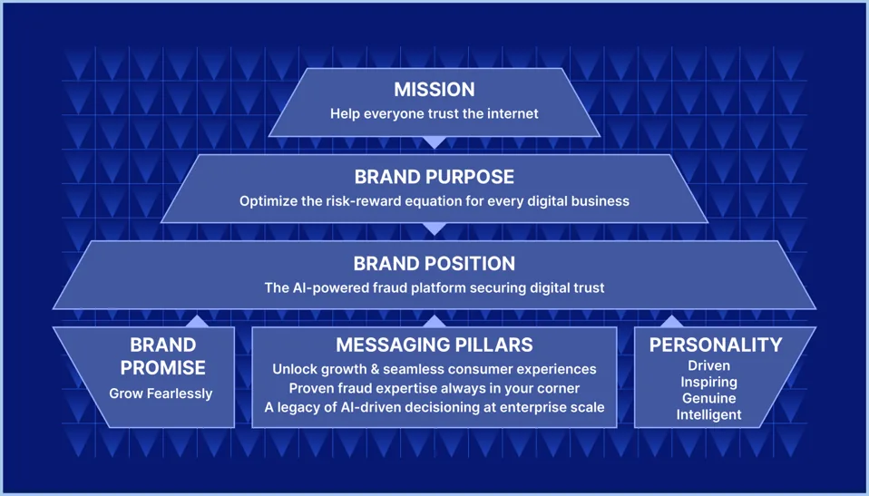
Sift brand and messaging pillars diagram covering mission, brand purpose, brand position, promise, pillars and personality.
Mission through personality on one page — the reference every downstream asset was checked against.
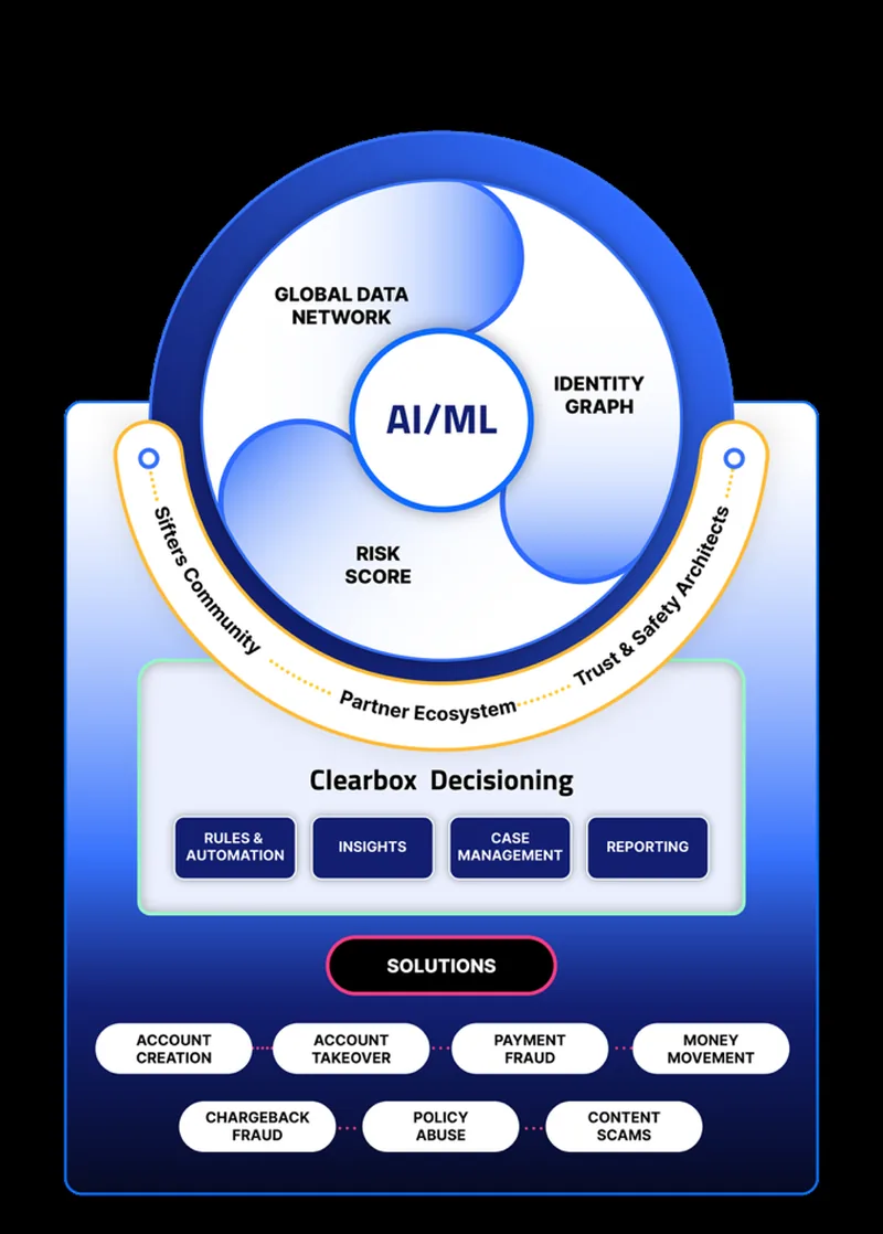
The Sift Platform marketecture graphic showing global data network, identity graph, risk score, AI/ML core and Clearbox Decisioning.
A single platform diagram replaced a product list, which is what made the platform story sellable.
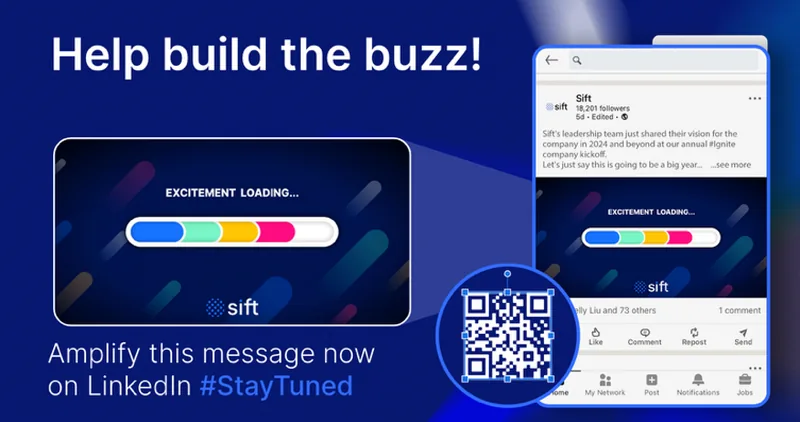
Help build the buzz internal social promotion asset with an excitement loading bar and QR code.
Employees were given the launch to amplify before external audiences saw it, with copy already written for them.

FIBR as its own brand

Sift's engineers had built an industry-defining fraud benchmarking tool intended to live on Sift.com. I argued it had implications well beyond Sift's own funnel and deserved to be its own brand.
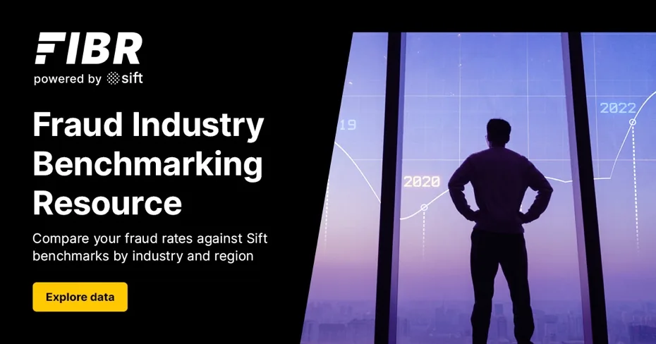
FIBR powered by Sift banner reading Fraud Industry Benchmarking Resource.
Named, and endorsed by Sift rather than absorbed into it — so the benchmark could be cited by people who were not Sift customers.
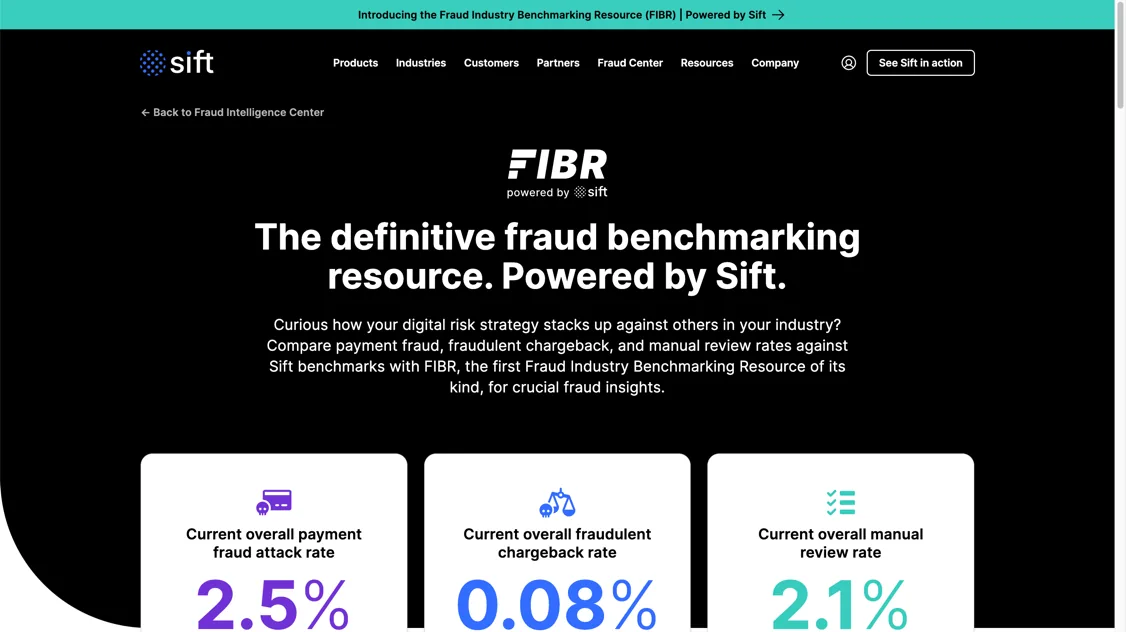
FIBR product page with the headline The definitive fraud benchmarking resource, powered by Sift, showing payment fraud attack, chargeback and manual review rates.
A dark mode and purple hero, neither of which had ever been used on Sift.com — the sub-brand got room to look different.
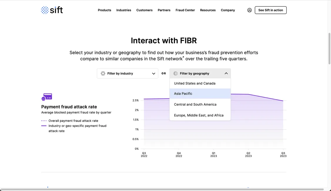
Interact with FIBR tool letting users filter fraud benchmarks by industry and geography.
Interactive by default: the value was in comparing yourself, not reading a report.
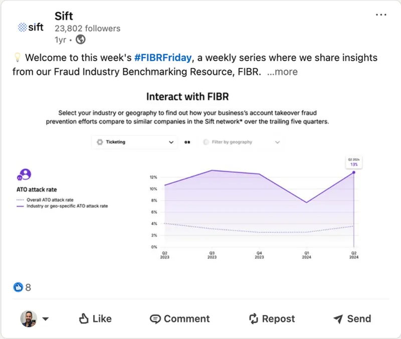
LinkedIn post for the recurring #FIBRFriday series showing account takeover attack rate benchmarks.
#FIBRFriday turned a one-off launch into a recurring reason to publish the data.

Launching the brand on the trade floor

To mark the launch we built the largest LCD screen on the entire MRC tradefloor, topped with a marquee crown running the new taglines inside and out, with demo booths built in every new colour of the palette.
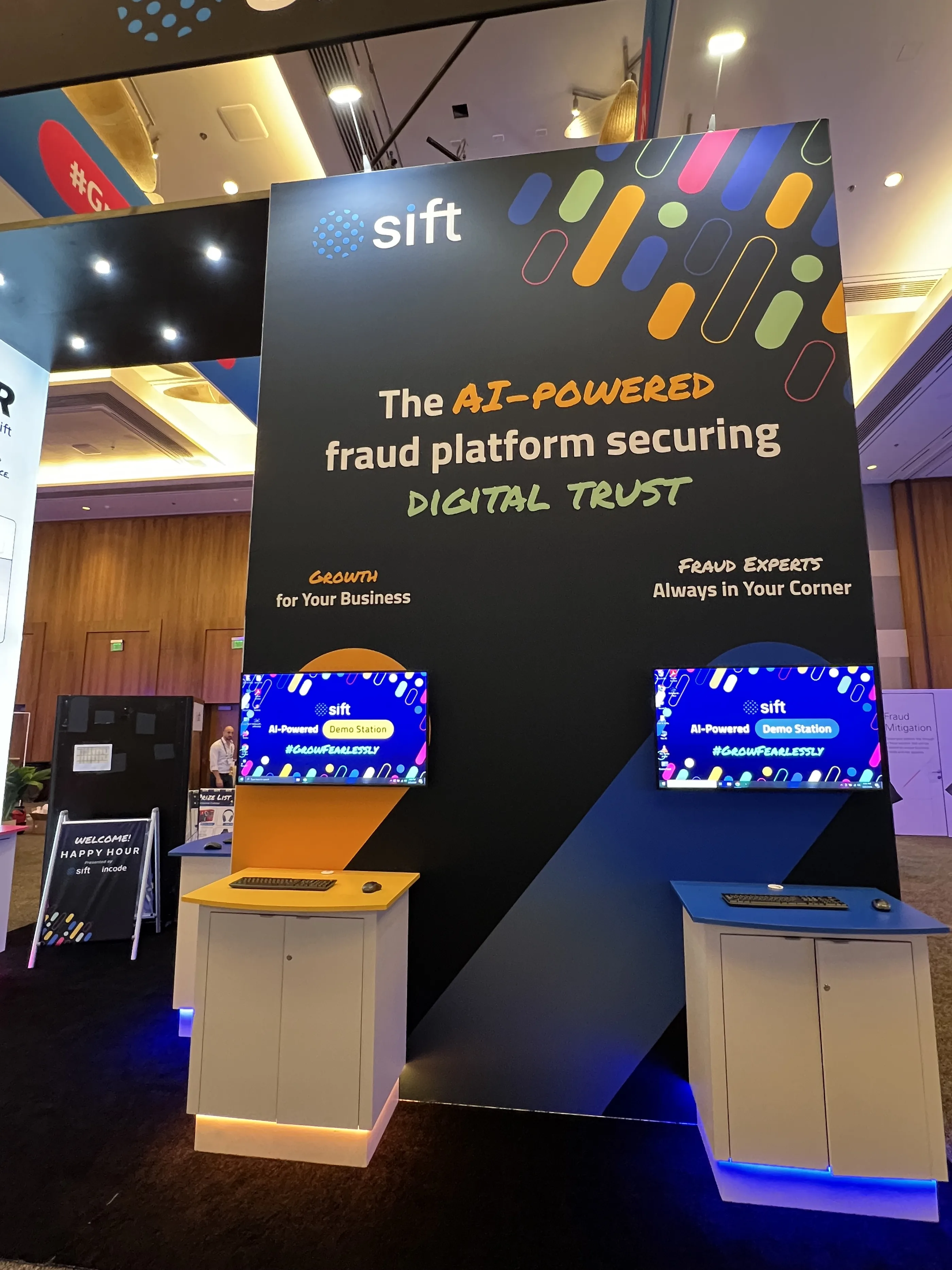
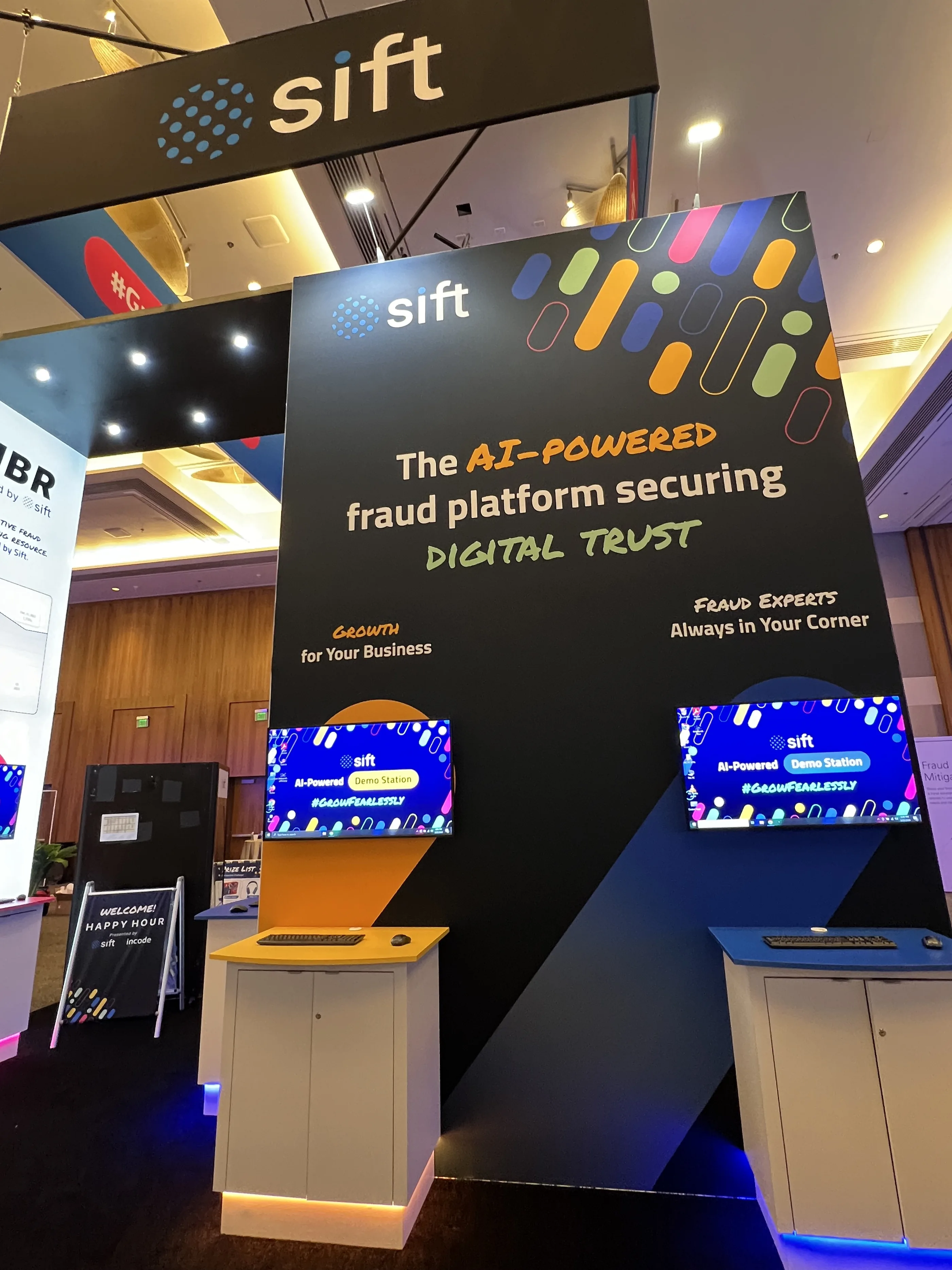
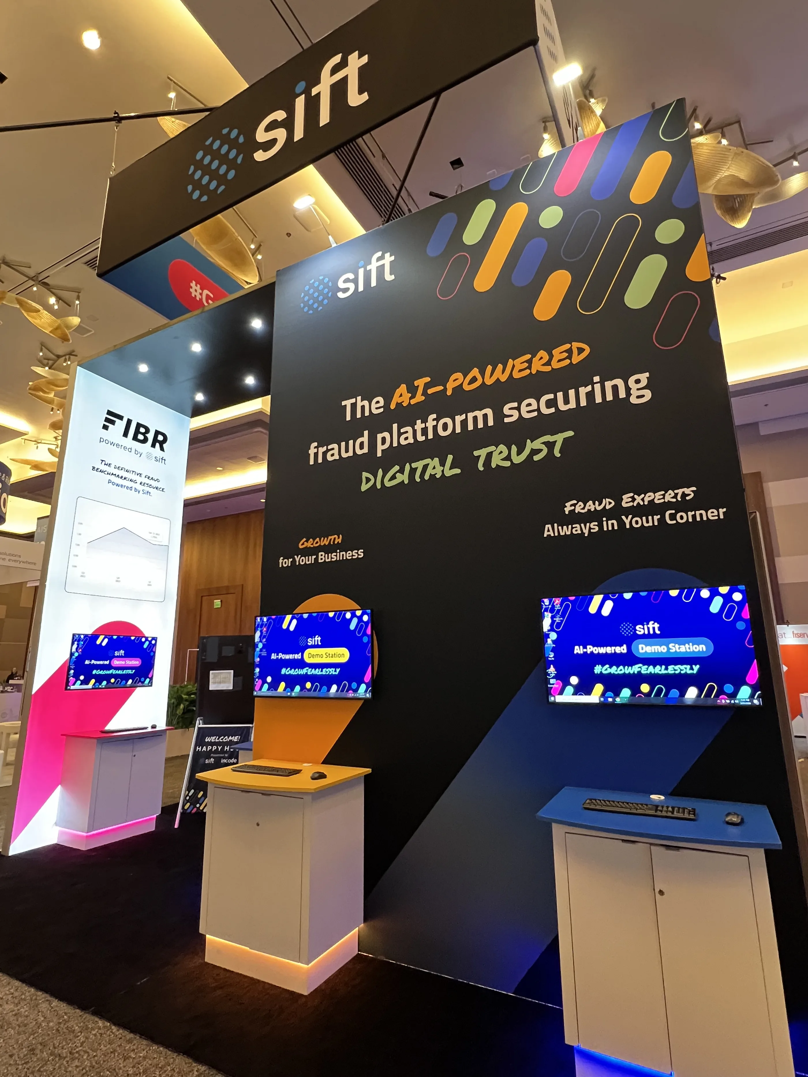
Sift MRC booth with an overhead marquee reading The AI-Powered Fraud Platform Securing Digital Trust and FIBR signage.
The marquee made the new positioning readable from anywhere on the floor.
Sift booth showing the large LCD messaging screen and colourful demo stations.
Custom Sift-branded crane machine with a Play to Win screen and Get Swag panel.
A branded crane machine guests scanned to play for premium prizes — floor engagement that produced a scan rather than a badge swipe.
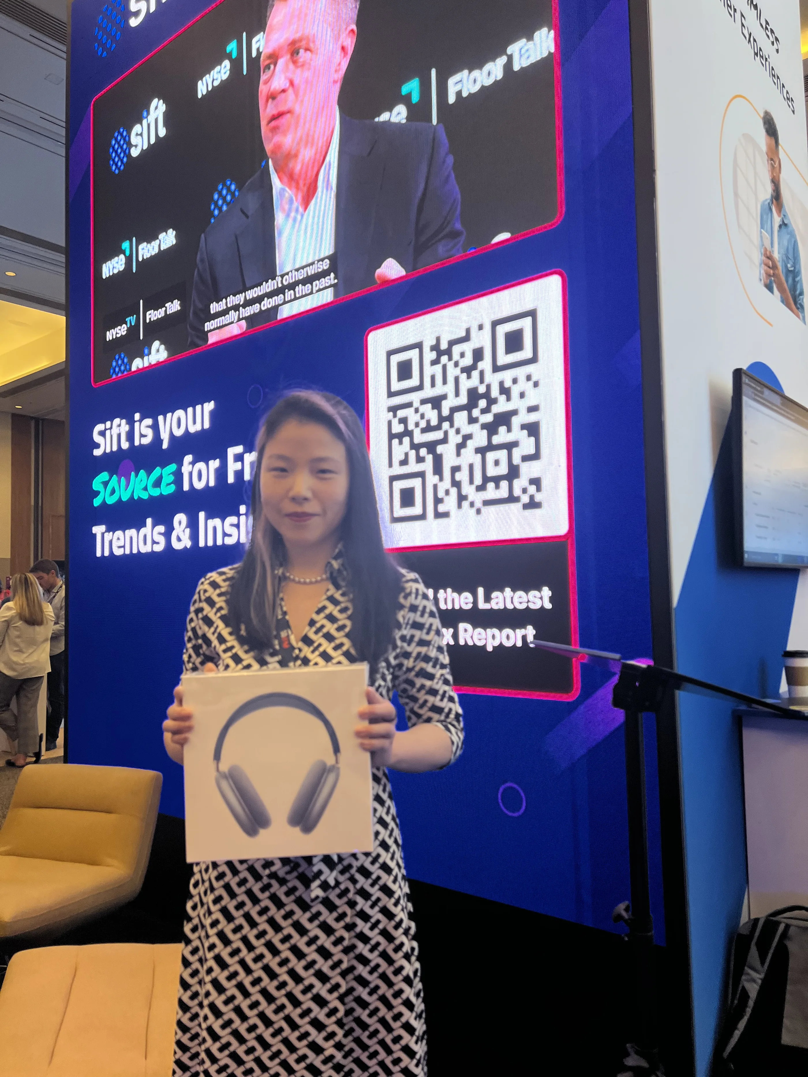
Attendees at the Sift booth during the MRC conference.
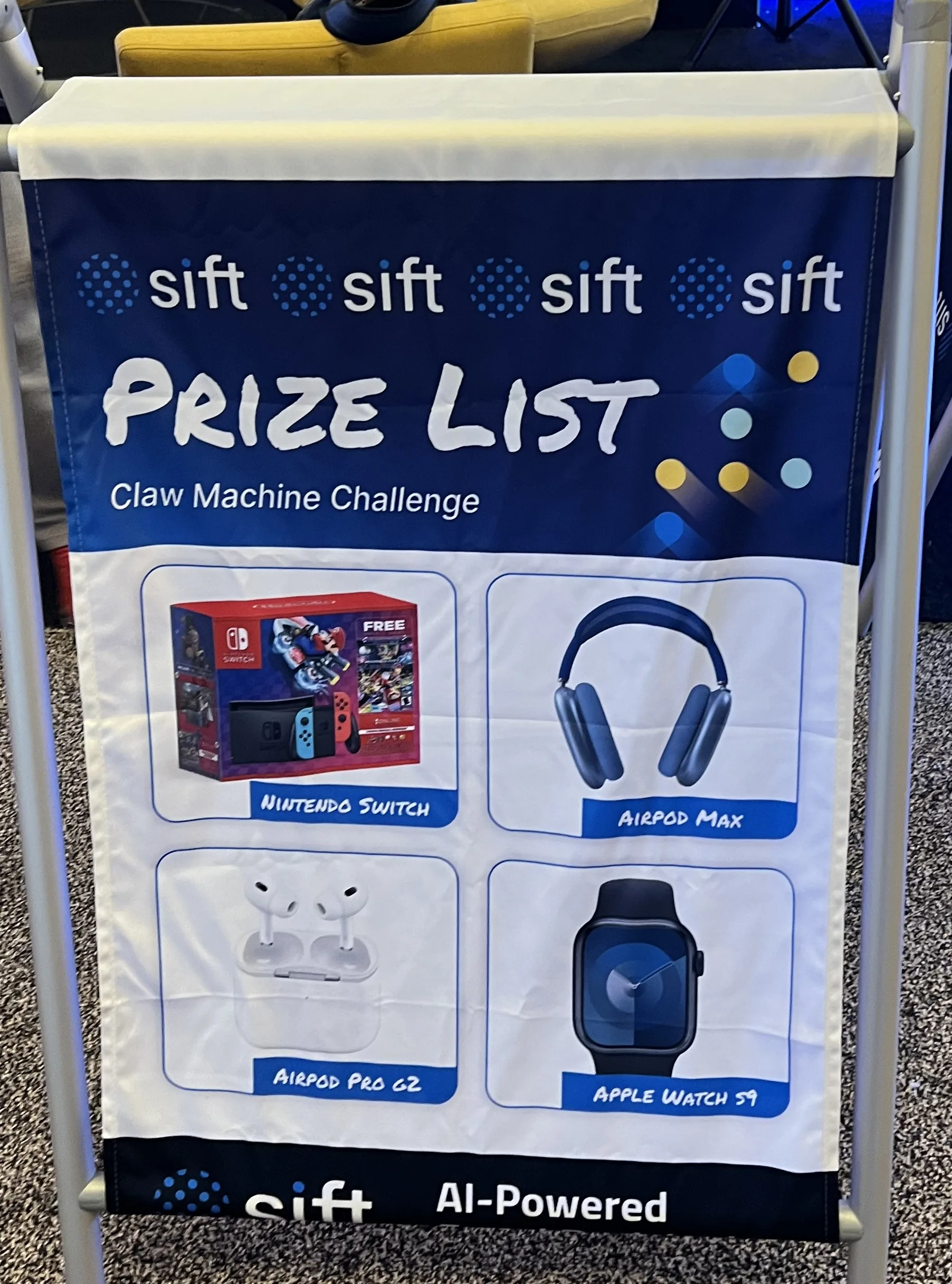
Sift prize list banner for the claw machine challenge showing AirPods Max, Apple Watch, Nintendo Switch and AirPods Pro.

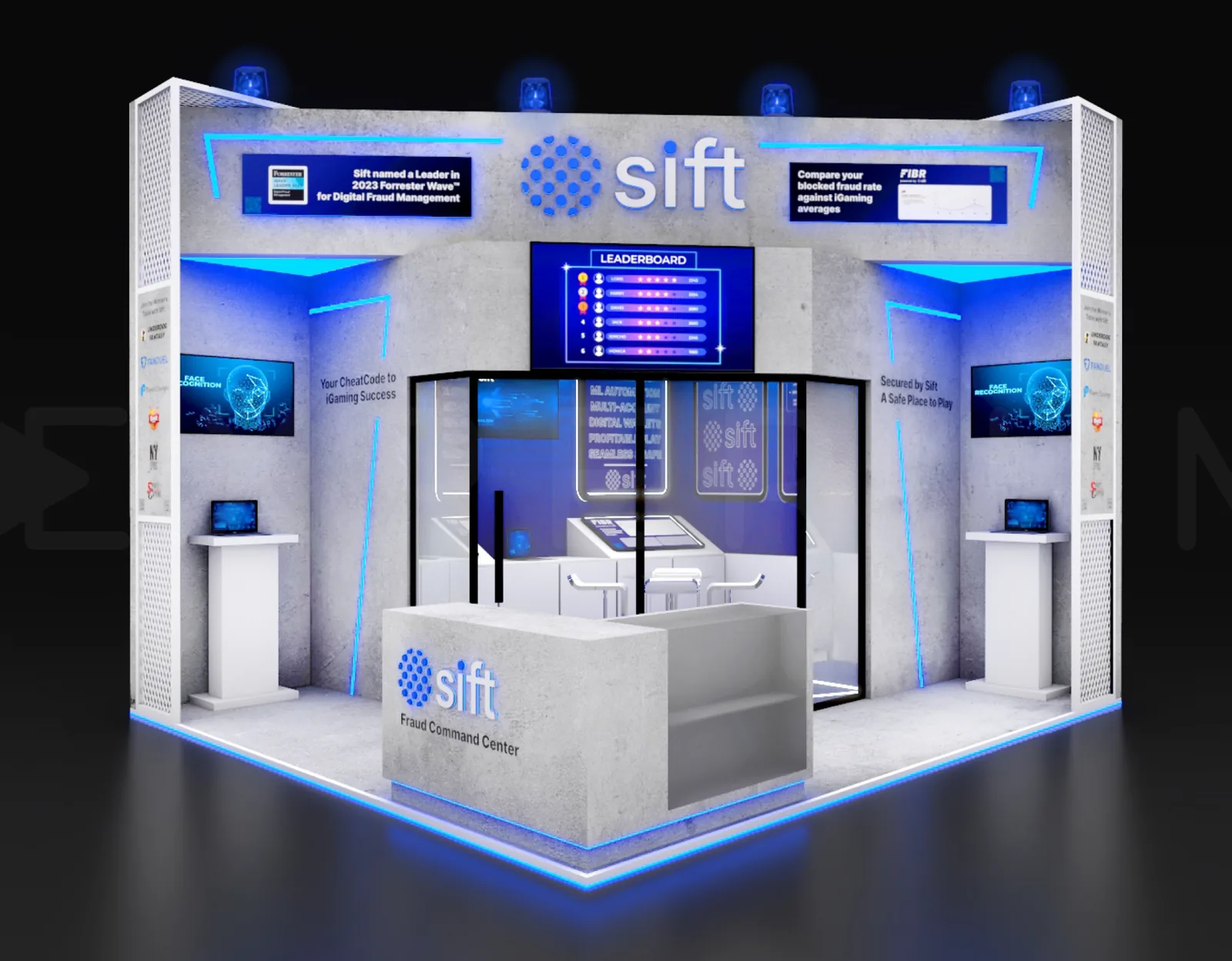
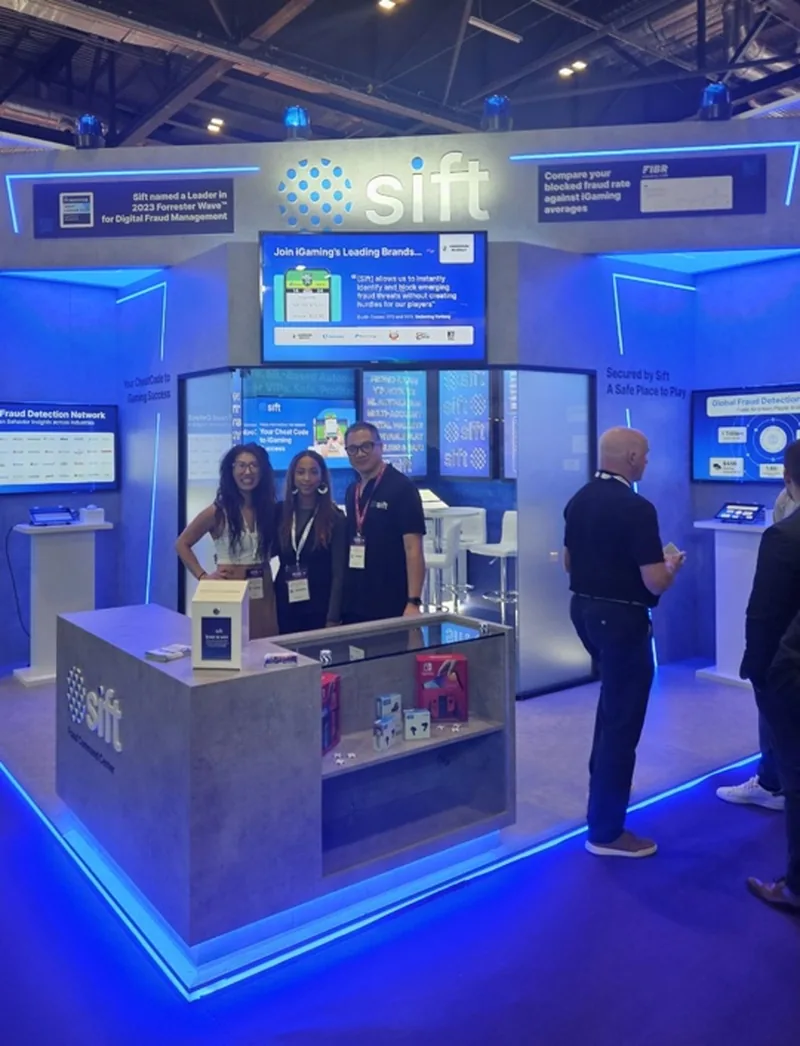
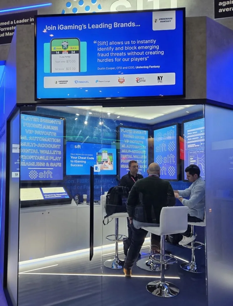
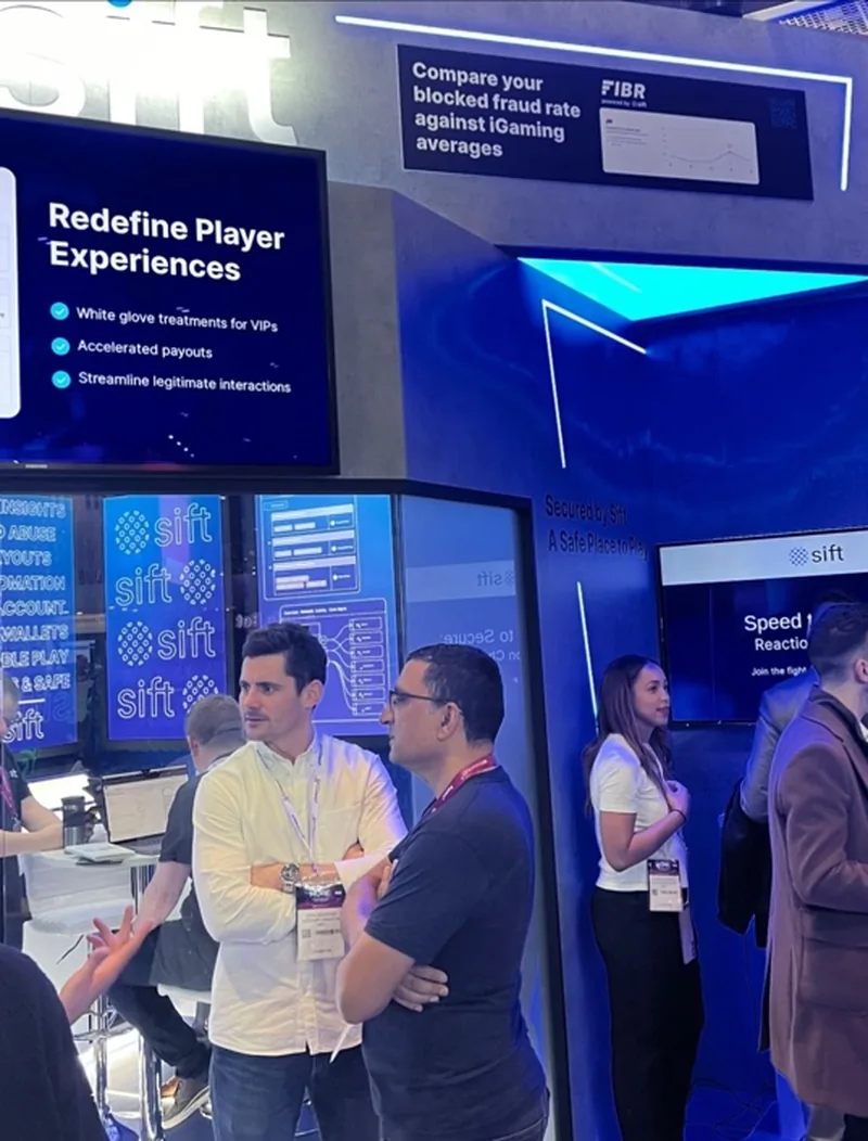
Fraud Command Center

Render of the Sift Fraud Command Center booth environment with leaderboard screen and dark blue lighting.
Designed as an environment rather than a booth — a command centre people stood inside, with a live leaderboard as the centrepiece.
The Fraud Command Center built out on the conference floor with staff and attendees.
Attendees seated inside the Fraud Command Center during a demonstration.
Redefine Player Experiences messaging inside the Sift environment.

iGaming, on iGaming's terms

Research said iGaming shows are more fun, lively and upbeat than typical tech or finance conferences. So we stopped bringing a finance-conference booth to them.
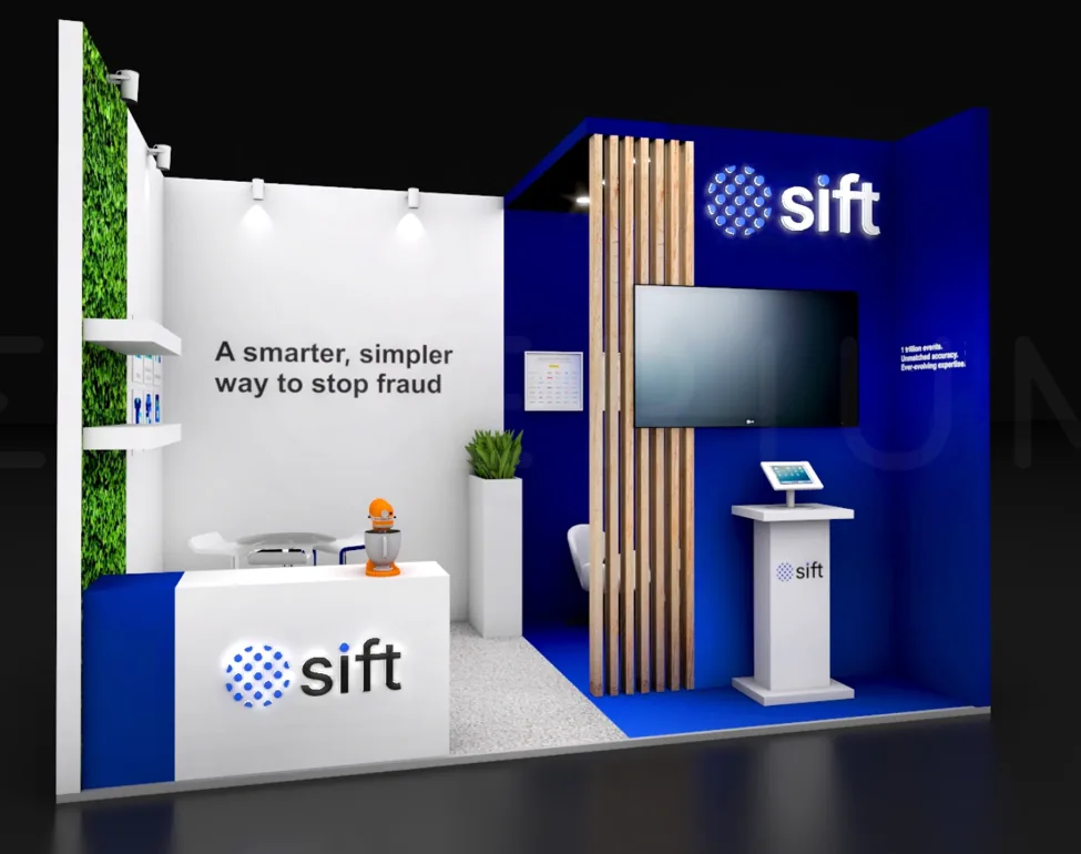
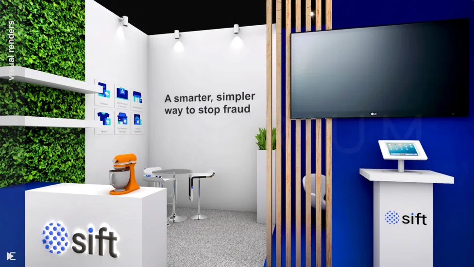
Render of the Sift iGaming booth with living green wall, timber slats and demo station.
Second render of the Sift iGaming booth showing A smarter, simpler way to stop fraud messaging.
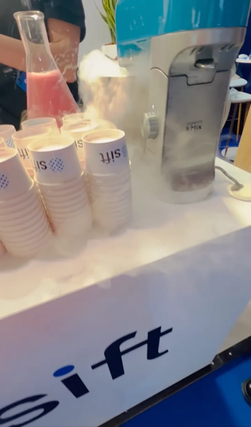
Liquid nitrogen ice cream being made at the Sift booth with smoke rising from branded cups.
A liquid nitrogen ice cream stand — chosen because the smoke was visible from across the floor, which is a distribution decision, not a catering one.
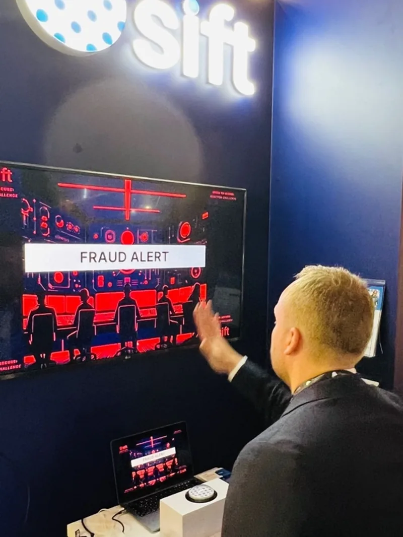
Attendee playing the custom Sift fraud alert response game on a booth screen.
A custom Sift fraud alert response game, with premium prizes for winners.
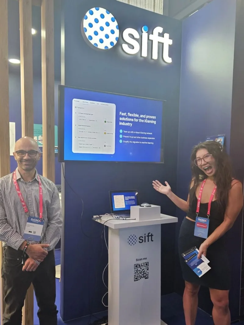
Sift staff presenting at the iGaming booth demo station.

What changed

  • Researched, defined and launched a global brand and go-to-market refresh spanning a new design language, website experience and sales enablement materials, following competitive whitespace analysis against Forter, Kount, SEON and Riskified.
  • Engaged user website sessions increased 90%, and overall brand impact score gained 12 points.
  • A cohesive regional event strategy delivered 5x ROI on branded events.
  • FIBR launched as a distinct sub-brand with its own visual identity, product page and recurring social content series.
  • The MRC launch activation was the largest booth on the trade floor, paired with a custom branded game built to drive targeted floor engagement.

Looking back

FIBR is the decision I would make again. Engineering built it to sit on Sift.com as a feature, and separating it was unpopular before it was obvious — a benchmark that only Sift customers can cite is not really a benchmark.

What made it work, though, was #FIBRFriday rather than the identity. A weekly publishing commitment is far easier to promise than to sustain, and the compounding came from the cadence, not the launch. The refresh got the attention; the recurring series did the work.